
- 15/12/2017
- Posted by: Millon Unika
- Category: Business, Web Design, Web Development
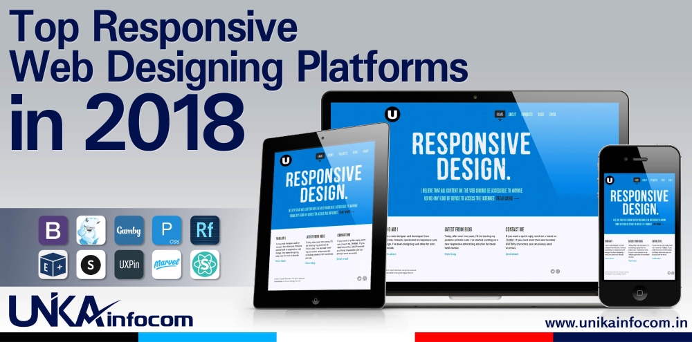
Top Responsive Web Designing Platforms in 2018
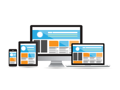
For any web design responsive layout has become the most essential thing over the last few years. Google already announced that Responsive Website is a must have feature for any business for ranking & promotion in google. Responsive web design provide a great user experience of a single site in various devices & screen sizes. In present day scenario if you can enrich the user experience, then you are out of the market competition. So it essential for all the web projects to have a responsive layout design. Here we will discuss about Top Responsive Web Designing Platforms in 2018.
You may also like: Top Link Building Tips for Higher Ranking 2018
1. Bootstrap
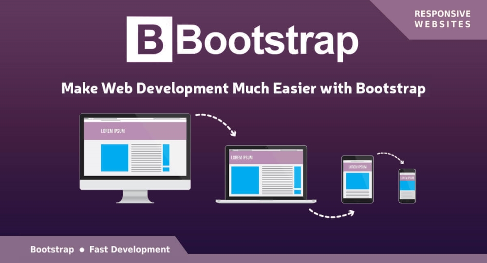
Bootstrap is currently one of the most popular, mostly used & leading front-end development frameworks among Web Designers & Developers. It has lots of advance features compared to other frameworks. For Responsive layouts it’s considered as the most handy & useful framework. Moreover it has got features like structured grid system, intuitive navigational element, user friendly interface, fully responsive, easily configurable front end option for CSS & so on.
For the responsive feature & strong mobile support of bootstrap; it can be viewed & accessed perfectly from any Smartphone & Tablets. Bootstrap features make the developer’s job very easy to setup an interface or design as it has a great startup guide & has numerous themes & layouts available. As it’s very popular so it has got a strong community for support.
2. Foundation
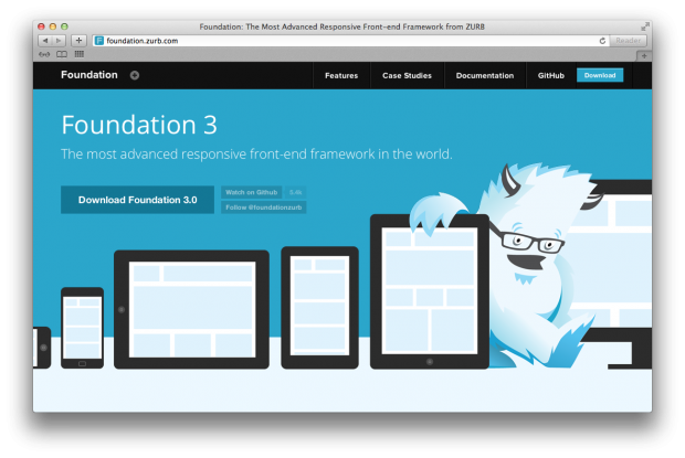
Foundation is also a great & one of the most advance front-end frameworks for responsive web designing & development. It’s also a great tool for mobile ready website designing. This is a highly responsive web designing framework mainly for advance & seamless website designs, web applications and most importantly for Mobile First web designs and email templates.
It’s less complex & easy to work on for new developers & designers. This tool has advance & attractive default layouts, navigation, media, library and more. Moreover it has smart & trendy plugin list which makes your web design more attractive. Furthermore this semantic, customizable & professional front end design & development tool is equally useful for Website Designers & Web Developers. Moreover this great tool is great for Mobile App Developers for creating Mobile First interfaces.
3. Gumby
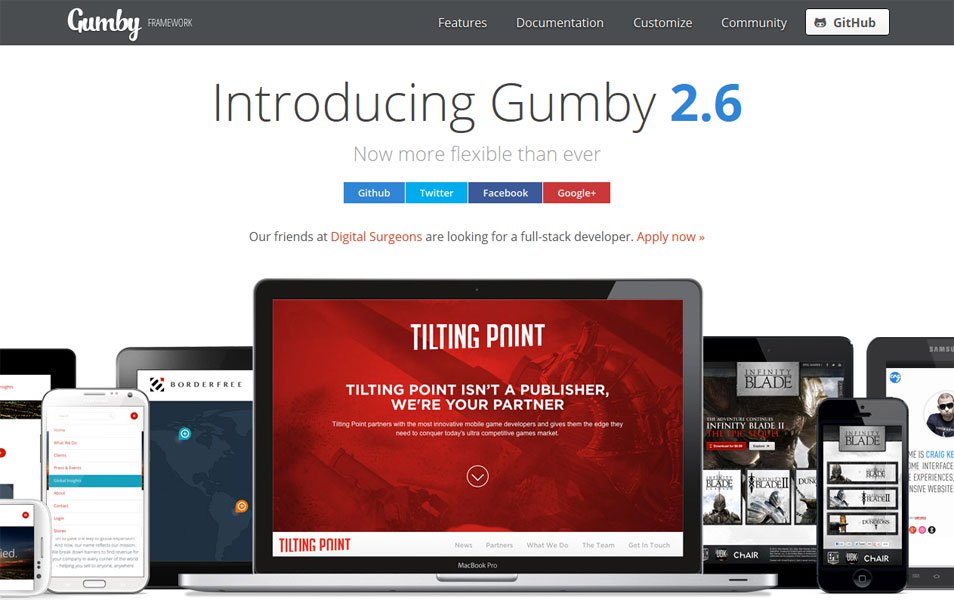
Gumby is another one of the leading & advance responsive web design framework with powerful CSS processor Sass. It’s also very easy to configure & customize.
Gumby2 has a plethora of features, tools & plugins for grids, forms, intuitive UI kit, buttons, navigation, toggles & switches, fancy tiles, shuffle, responsive images, dropdowns, tabs, drawers and templates. Its also very useful for embedding responsive images & videos. This vast variety of smart & trendy tool options make the job of a designer easy but with an attractive look & feel. This is a very flexible CSS framework for front end development.
4. Pure

For web projects Pure is certainly one of the most popular choices among developers. It’s basically the tiniest set of CSS modules which you can use almost in any projects. That’s the reason which makes it such a handy and useful tool for web development.
It has some cool, smart & attractive layouts for almost everything starting from blog, email, photo gallery, landing pages, pricing table, responsive side menu, responsive horizontal & vertical menu, scroll bar menu etc. which makes your web design easier & smarter. Moreover It’s easy to use & customize. It also focuses on Mobile Ready interfaces & as it’s a tine CSS resource, therefore it’s a great option for having an optimized web layout.
Also it has an extensive range of CSS components. Its features consist of layouts, base, grids, tools, buttons, navigation, tables, menus etc.
5. Export Kit

Export Kit is a very unique & excellent tool for creating responsive Web & App Layouts from Photoshop, Illustrator or InDesign.
This useful tool can instantly convert your Photoshop files & components into HTML, CSS, JS, WordPress, Visual Studio, Android, iOS & more. So Export Kit is certainly the newest & futuristic approach for creating responsive web design. This smart tool gives designers the leverage to design & edit layouts in Photoshop for any device or platform & then generating a full-fledged website or web & app layouts by converting the prototype Photoshop project.
With this great tool you can export assets such as full source code, UI controls, themes & styles, sliced images, external scripts, responsive screens, pixel-perfect, dynamic layout, multiple pages and lot more with over 300 features for conversions. It reduces your lengthy code writing time by generating full source code, also gives you a platform to experiment with your visual layouts & makes your designs more creative.
6. Adobe Edge Reflow
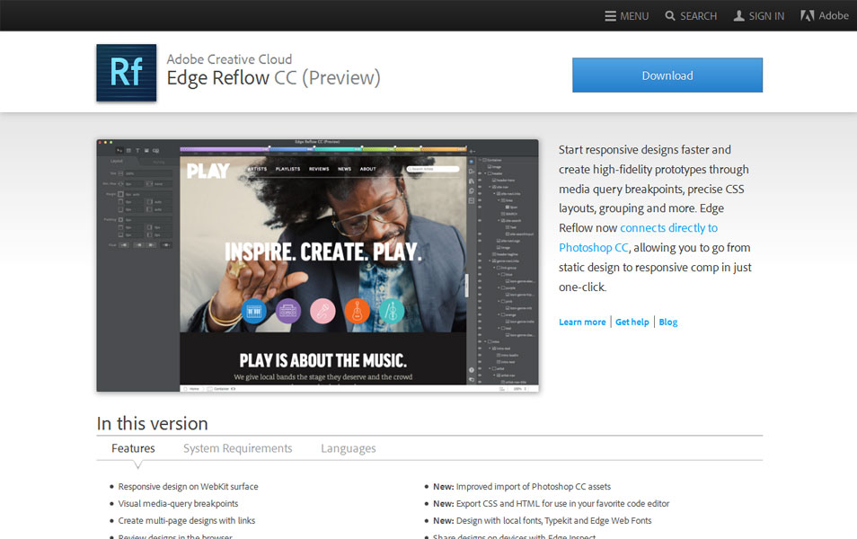
Edge Reflow is a unique tool from Abode for actually creating a responsive website virtually & visually. Its more like creating a prototype. As it’s from Adobe, therefore it has a strong support & help available online. It has a lot of features & tools which is cool & attractive. Adobe Edge Reflow basically converts Photoshop components or files into HTML and CSS and adjust the design easily according to the need. It makes the work for any designer very easy. As it visually creates a website prototype; therefore it’s easy to adjust your design before creating the CSS & HTML.
It also has drag & drop option & panels where you can edit your design. If you have knowledge in CSS & HTML then you can create excellent responsive web prototypes with this tool.
It has features like responsive design on WebKit surface, visual media query breakpoints, design reviews in the browser, advance import from of Photoshop contents, advance conversion from Photoshop content to CSS & HTML, integrated fluid grid system and much more.
7. Skeleton

Skeleton is a very light weight framework for responsive web design & it mainly developed for mobiles ready interface. It’s easier to install & use. For its very light weight it can be easily used for various responsive web design projects & mobile platforms without using much resource. It has a 960 grid base which is very light & helps to creating mobile ready websites & web layouts, websites & web layouts for desktops, laptops, tablets and other smart devices without quality compromise. Moreover it has default features like basic UI elements, forms buttons, foundation design, tabs, organized file structure & a lot more web design & development features which reduces the time for writing codes for web design.
8. UXpin

UXpin is a great tool for creating responsive web design prototypes, documents & design systems. It’s a online design tool & app for creating interactive wireframes and prototypes with real time collaboration. This powerful tool kit has common design elements and a vast library of custom UI elements for creating interactive wireframes & prototypes with lesser effort & time. You can create attractive & beautiful web designs with this tool kit.
Moreover it has features like design, share & testing prototypes, rapid collaborative design for small teams, end to end UX solution for mid to large teams, instant feedback from team or client, easy way for – create & review iterations, scale consistency, modular design system, manage documentation & also it auto generates specs for designers & developers.
9. Marvel
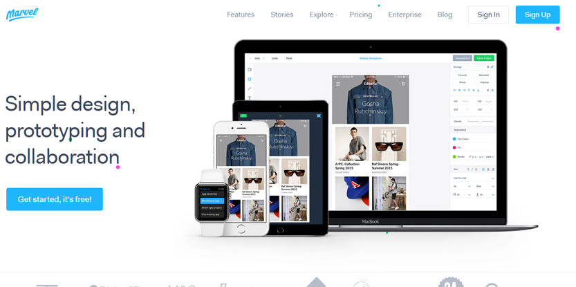
Marvel is another brilliant online tool for creating & collaborating responsive design prototypes for Mobile Apps and almost any Web projects. For designers it’s a great tool to visually create & experiment with the web prototype design. It also offers a platform for the designers to become more creative in shorter time & effort.
You can directly create in marvel framework using its tool kit, or you can add images, sketch, mockups or Photoshop file for creating prototypes for responsive web design. You can even sync your files with marvel framework from cloud storage. It’s a simple & easy to use framework mainly for prototyping layouts for Desktop, iPhone, iPad, Apple TV, Apple Watch & also Android.
Moreover this online tool has a great collaborative feature for easily sharing your projects with tea members or clients to get real time feedback. It has a panel for your collaborators for real time feedback message on every screen of your design. You can even make a chat conversation with onboard collaborators.
This actually far more better option for creating a real kind visual prototype for your Web & App project that is more attractive than the conventional PPT presentation.
10. Semantic UI
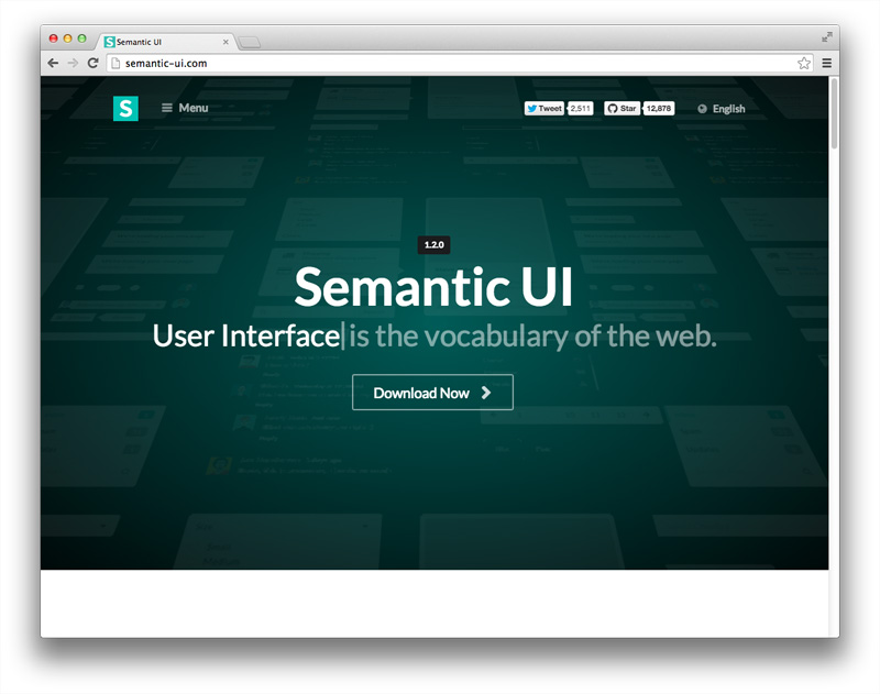
Semantic UI has become more popular among the web designers & developers from the past few years for its ease of use & advance features.. The USP of this framework is that its design approach can be easily incorporated with other responsive web design frameworks. It uses third party style guide for design and has a lot of default elements like buttons, loaders, divers, navigations, collection of forms, breadcrumbs, intuitive JS library and much more. You can easily design & develop Responsive websites for desktop, mobile, tables & other smart devices using this Semantic UI.
It has more than 50 UI components & 3000 plus theming variables for web design & development. Also running code & debugging with this framework is very easy.
This framework also has advance modules like popups, dropdowns, to sticky bones and more.
You may also like: Top Mobile Marketing Tips to Increase Your Business in 2018