
- 01/12/2018
- Posted by: Millon Unika
- Category: Business, Mobile App, Web Design, Web Development
Best Mobile Responsive Web Development Tools 2019
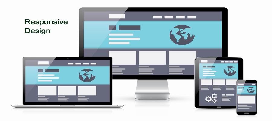
We know how important is to have Mobile Responsive web presence now a days. There is a huge impact of responsive sites in digital marketing. Moreover Google already declared that they will give preferences to the Mobile Ready, Mobile Optimized & Responsive Websites & Web Apps in their SERPs. Here we will discuss about Best Mobile Responsive Web Development Tools 2019.
You might also like: How to Customize WordPress Website without Coding 2019
1. Bootstrap
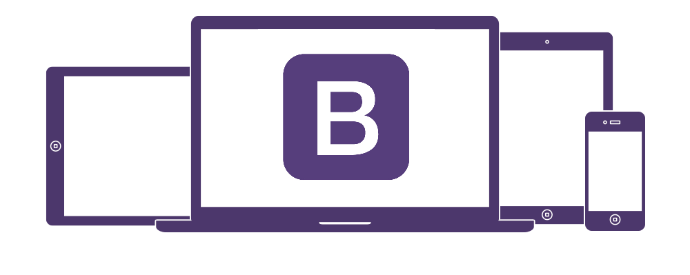 For responsive & mobile ready web layout Bootstrap is one of the most popular tools. It’s hugely used by web developers around the world. Its ease of use made it famous among the developers. Moreover it’s huge in-built web element library & templates can be used to create fully responsive mobile ready web applications.
Currently Bootstrap 4 version is running, therefore we can see that its evolving with the cutting edge technology & features. It also has got a huge community support. Bootstrap is indeed the best solution globally for creating responsive front-end layouts for web application. Above all it’s an front-end based open source toolkit with advance navigations, forms; and the best & largest HTML, CSS & jQuery library.
Most importantly it’s a flexible library which is also compatible with other third party libraries. Also it’s compatible with all the modern browsers. It has always been developers’ first choice because it has lots of in-built web elements & themes which helps to create attractive web layouts reduces dedicated designing work for the front-end of any web application.
2. DevTools

Another giant browser based tool for mobile ready front-end web development which is equally popular among the developers across the world is DevTools. Its compatible with all the modern browsers like Firefox, Chrome, Edge, Safari, Opera etc.
You can open DevTools in your browser and customize your page design and also preview the changes. DevTools have below mentioned featured tabs to debug, design & preview your responsive web layout for web pages and web applications.
- Elements – You can point any section and find web elements in your HTML page.
- Source Code (JavaScript) – This smart tool allows you to debug JavaScript code in your browser itself.
- Styles – It allows you to work on your CSS for mobile responsiveness.
- Network – This is the content downloading time to your browser.
- Console – From Console you can examin & debug JavaScript errors & syntaxes.
- Performance – Performance helps you to analyze HTML rendering time for proper display of your web layout.
The most useful feature of it is the Device View. With device view you can directly switch and preview how your web page layout will look on different devices like, laptop, mobile or tabs.
By pressing F12 you can open DevTools in your browser and use its features to design or customize your webpage. This tool is very effective for both the designers & developers.
3. Blisk
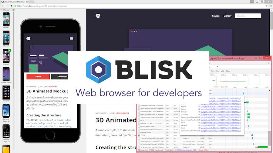
Blisk is the most trending browser for designing & customizing front-end of a web application. It mainly allows developer to design & preview their pages. It’s the first designer & developer based browser. It’s becoming more & more popular among developers. Blisk provides a smart platform for developers where they can collaborate & preview their work and develop web application faster than before. Moreover it has cloud storage where developers can directly upload their work screenshot and team members or clients can view it. It allows you to switch between different device views like laptop, mobile, tab etc. with this option you can easily preview how your design will look on different devices. It’s definitely one of the best tools for creating mobile responsive web apps.
It has various useful features for front-end designing such as; Side-by-Side View, Auto Refresh, Responsive URL & Scroll Position Sync., Multiple DevTools- Separate DevTools for Desktop & Mobile, Error Notifications, Screenshot & Screen Recorder, Cloud Storage & Upload.
4. CanIUse.com
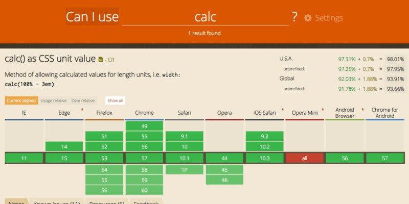
Hybrid web development for mobile ready sites is getting popular day by day for its attractive looks & cross platform compatibility. With daily evolving & advancement of JavaScript you can enjoy almost native experience of your web apps in your smartphones. Here CanIUse.com can be helpful to search for the exact technology you are looking for to develop your mobile ready web application. It basically searches & determines that which CSS library or JavaScript modules you can use in your responsive web app according to the demand.
5. Bootsnipp
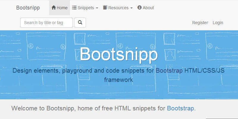
We have already discussed earlier that Bootstrap is the most popular framework to develop Responsive Web Application front-ends. So with its huge acceptance among the majority of the developers a whole site has been created called Bootsnipp that contains Bootstrap Code Snippets & Library. It also got famous among the developers as they can grab & use built-in Bootstrap snippets directly from this site & can develop their Mobile Ready Web Application.
Here you can search through different design categories & elements for your front-end. Moreover you can select suitable web elements for your Bootstrap web layout & examine HTML, CSS, JavaScript snippets & libraries. This site also provides information guide for implementing Bootstrap code snippets into your Web App. You can find the maximum number of Bootstrap snippets in Bootsnipp compared to other similar sites.
7. Test My Site – Think with Google
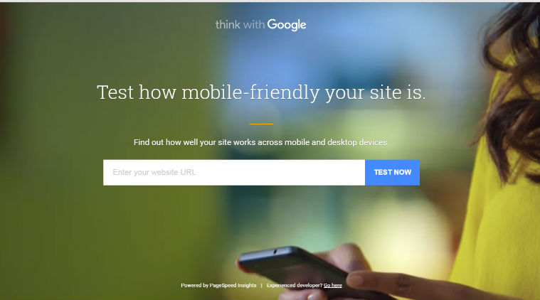
Google already declared that they will give preferences to the Mobile Ready, Mobile Optimized & Responsive Websites & Web Apps in their SERPs. Therefore developers & site owners were looking for a proper website & application checker to their site’s mobile optimization level, performance, responsive looks & compatibility. The best option could be Google’s own tool to test this.
Google introduced its tool called ‘Test My Site – Think with Google’ to resolve the issue and became very popular. This tool examines your site and notifies you with the scopes to make your site Mobile Ready & responsive. It gives you a full report of your site and you can figure out how you can make your sites mobile optimization level more perfect.
This brilliant tool checks your sites HTML, CSS & JavaScript code optimization level, performs speed check of the site’s page loadings, determines site’s image optimization level, also performs user accessibility, usability & compatibility check and much more and generates a proper & detailed report for you to take necessary actions.